Improving how users understand, assess and act on risk across web and mobile.
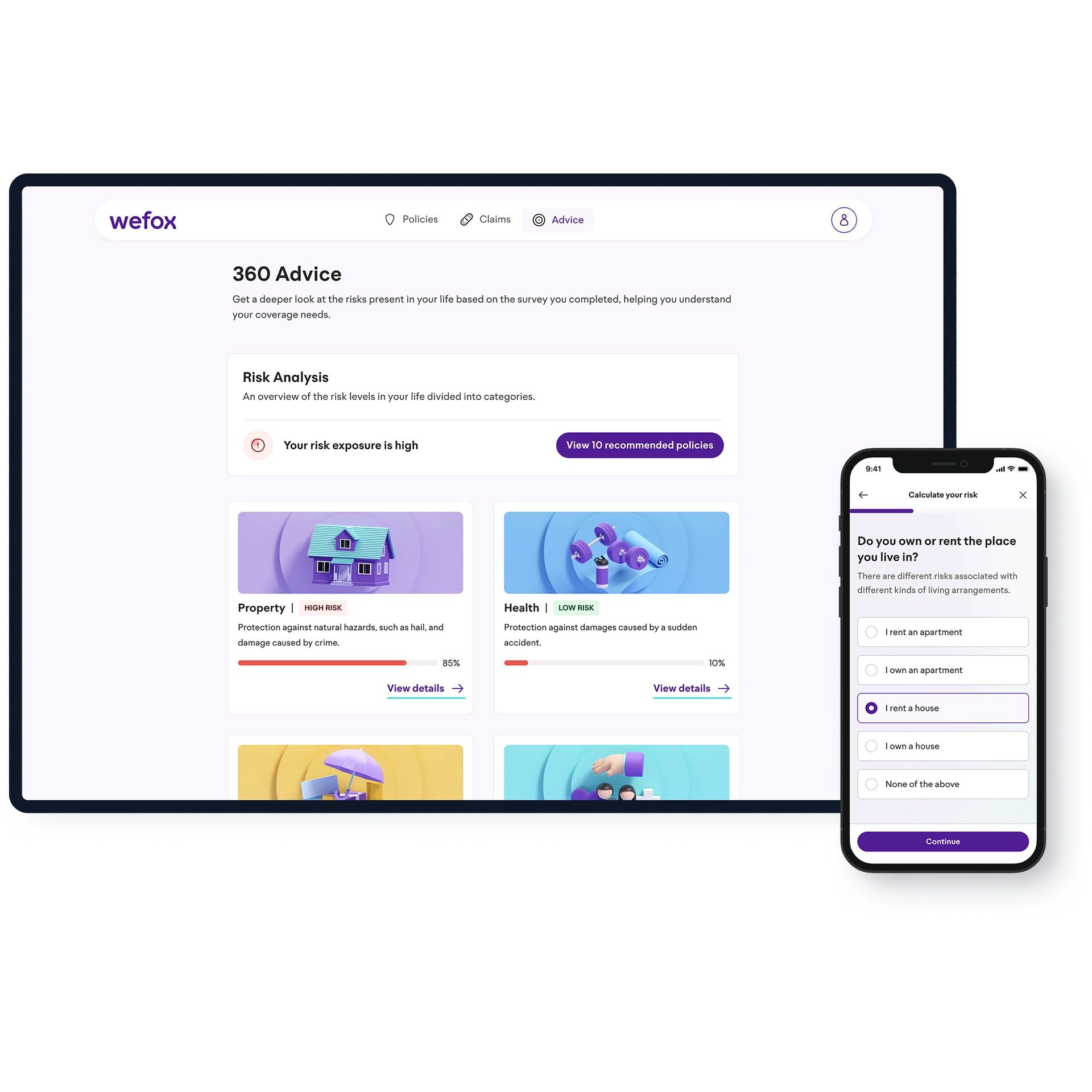
Risk Analysis originally lived on the web. As the product expanded into the app, I explored how its information-heavy experience could translate to a smaller screen without losing clarity.
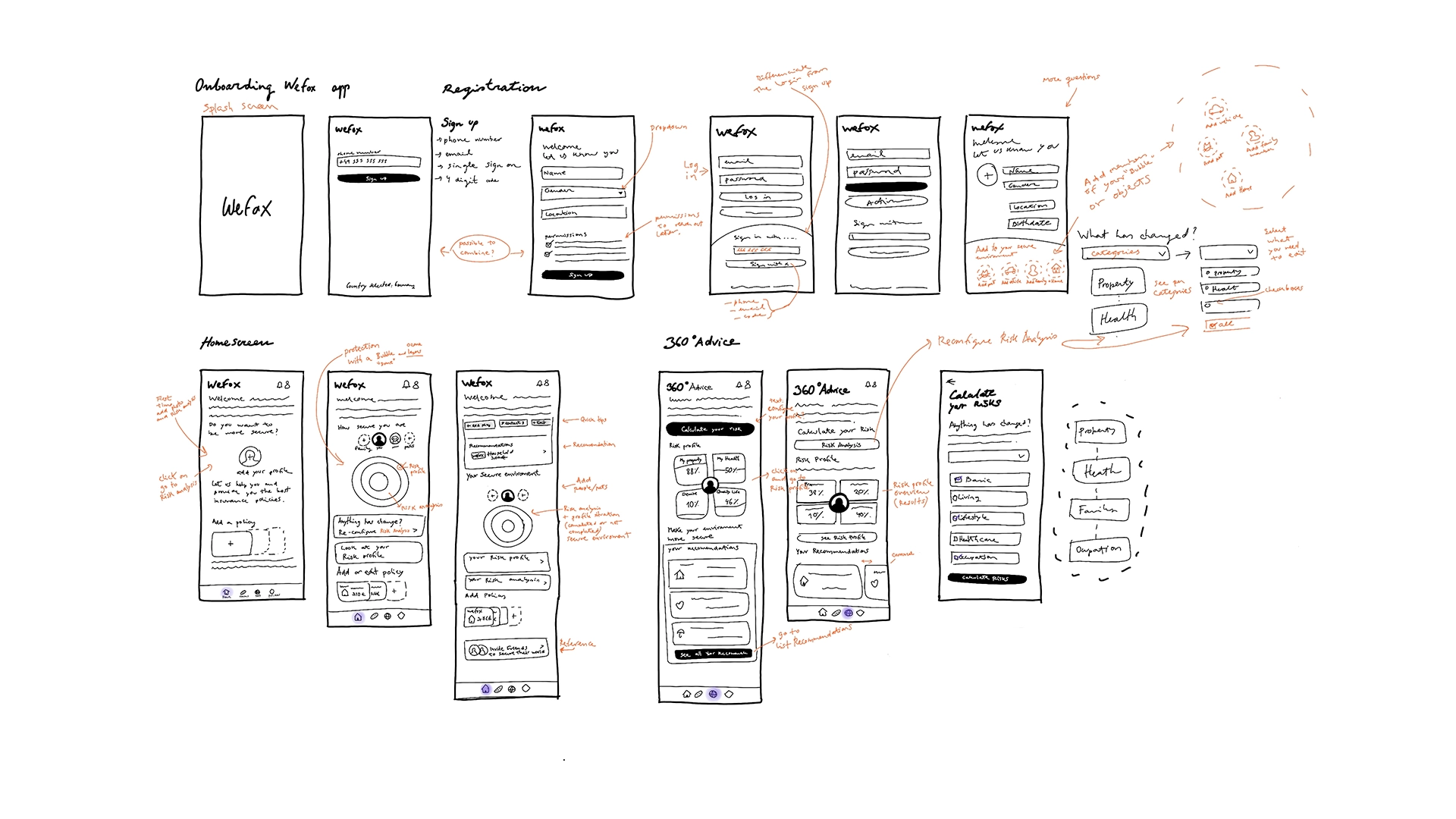
I started from the existing product and explored different mobile structures, prioritising the information users needed to understand their risk and take action.
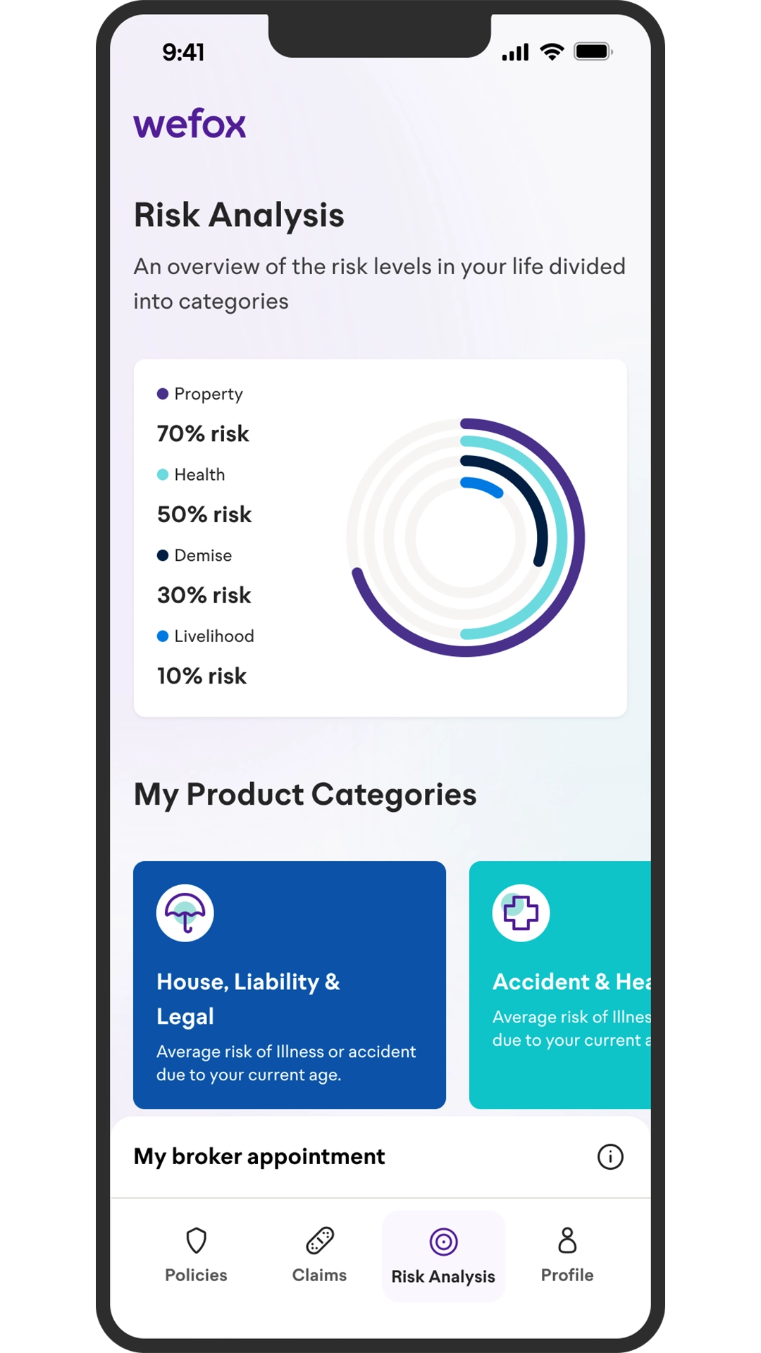
We tested early mobile concepts to understand how users interpreted the risk information and where the experience was creating confusion.
The sessions revealed several issues with hierarchy, terminology and how risk information was represented, which informed the next iteration.
• Colours were difficult to distinguish.
• Percentage rings were unclear.
• Risk and coverage were difficult to differentiate.
• Horizontal risk categories were easy to overlook.
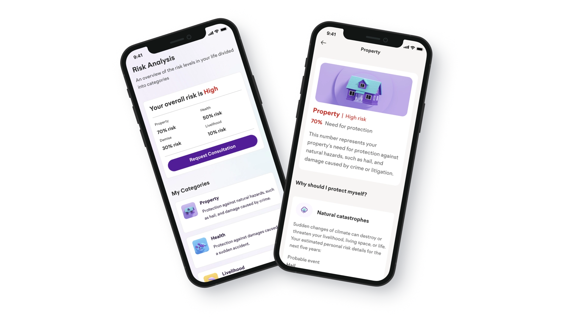
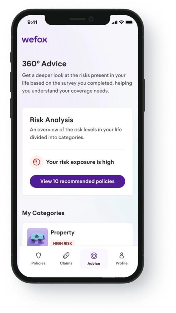
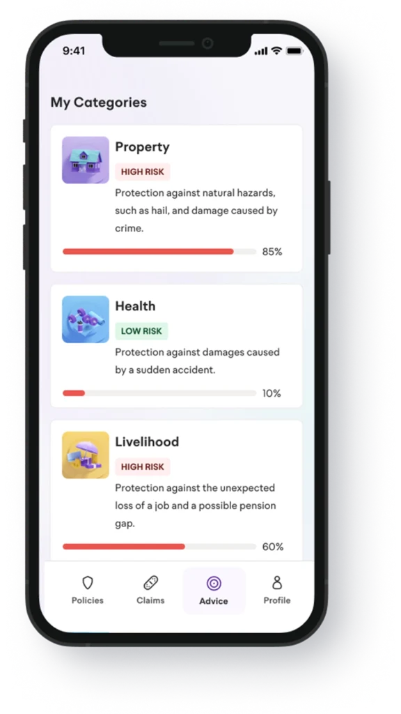
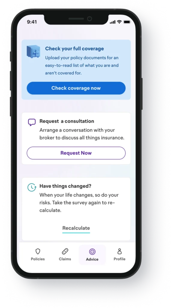
Based on the findings, I simplified the hierarchy, made categories easier to scan and reduced the reliance on colour alone. The revised mobile experience gave users a clearer overview of their risks and more obvious paths to the next action.
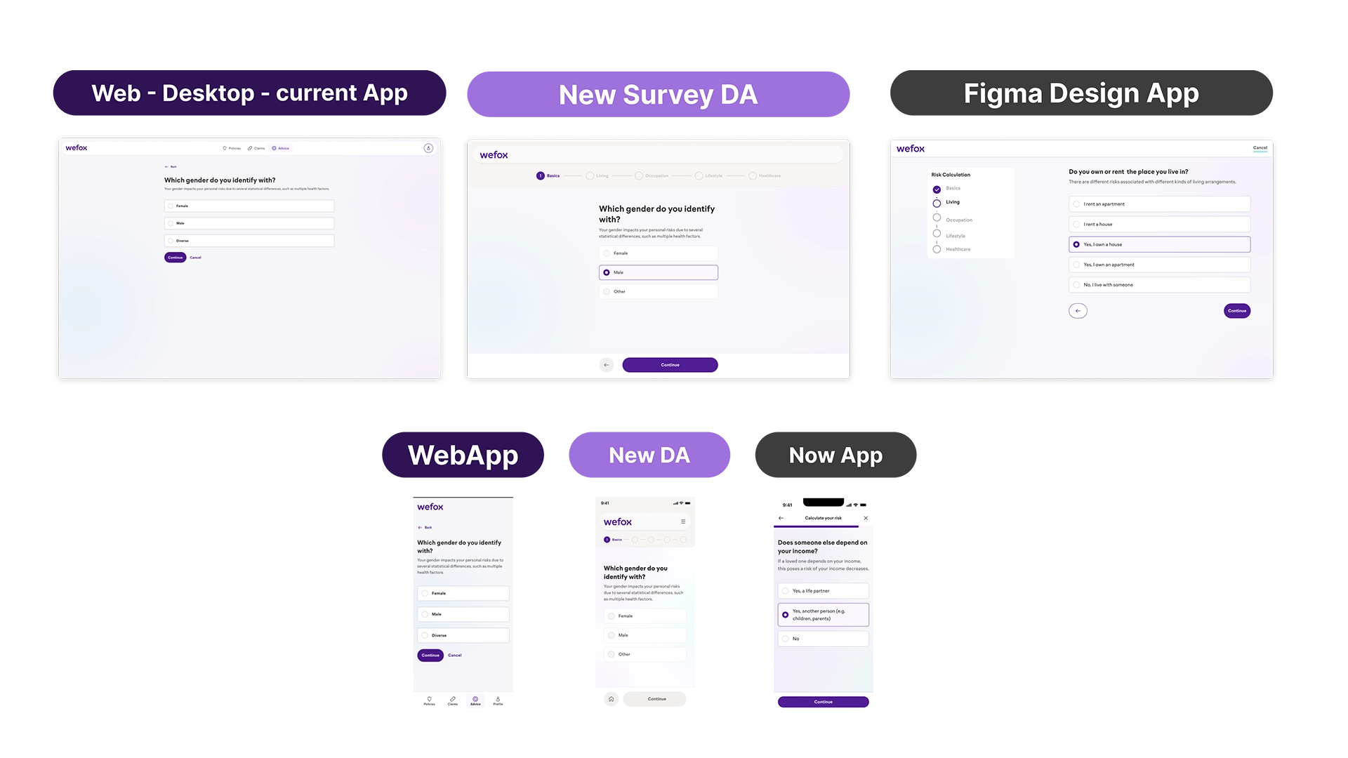
Users were dropping out of the Risk Survey before reaching their results, so I revisited how progress was communicated throughout the journey.
I explored different combinations of steps, labels and progress patterns to help users understand where they were, what they had completed and what was still ahead.
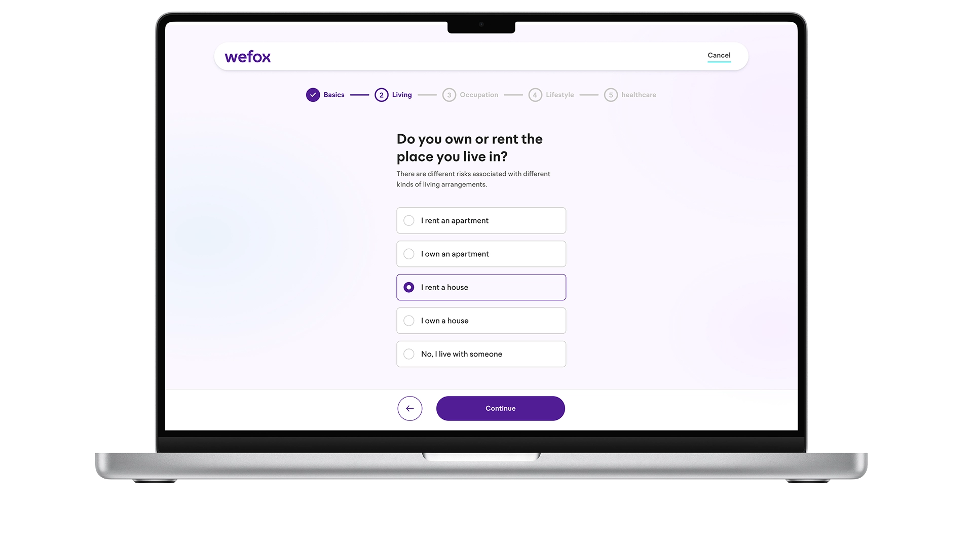
The final direction introduced clear states for each stage:
Current — the category being completed
Completed — previously finished categories
Upcoming — categories still to come
The pattern was adapted across desktop and mobile to preserve the same mental model on both platforms.
As new functionality was introduced, the Risk Analysis experience became increasingly different from its original structure.
Working alongside another designer, I explored alternative ways to organise risk information and make new actions easier to understand without increasing visual complexity.
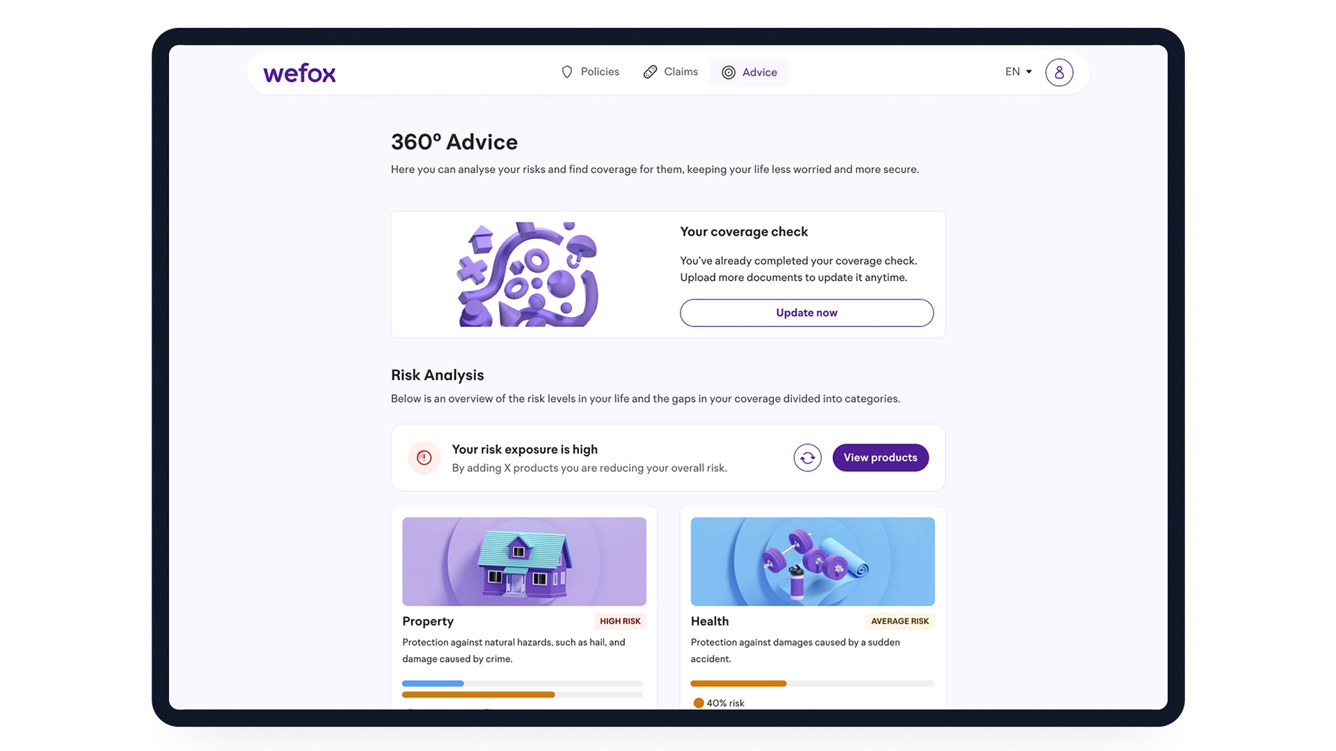
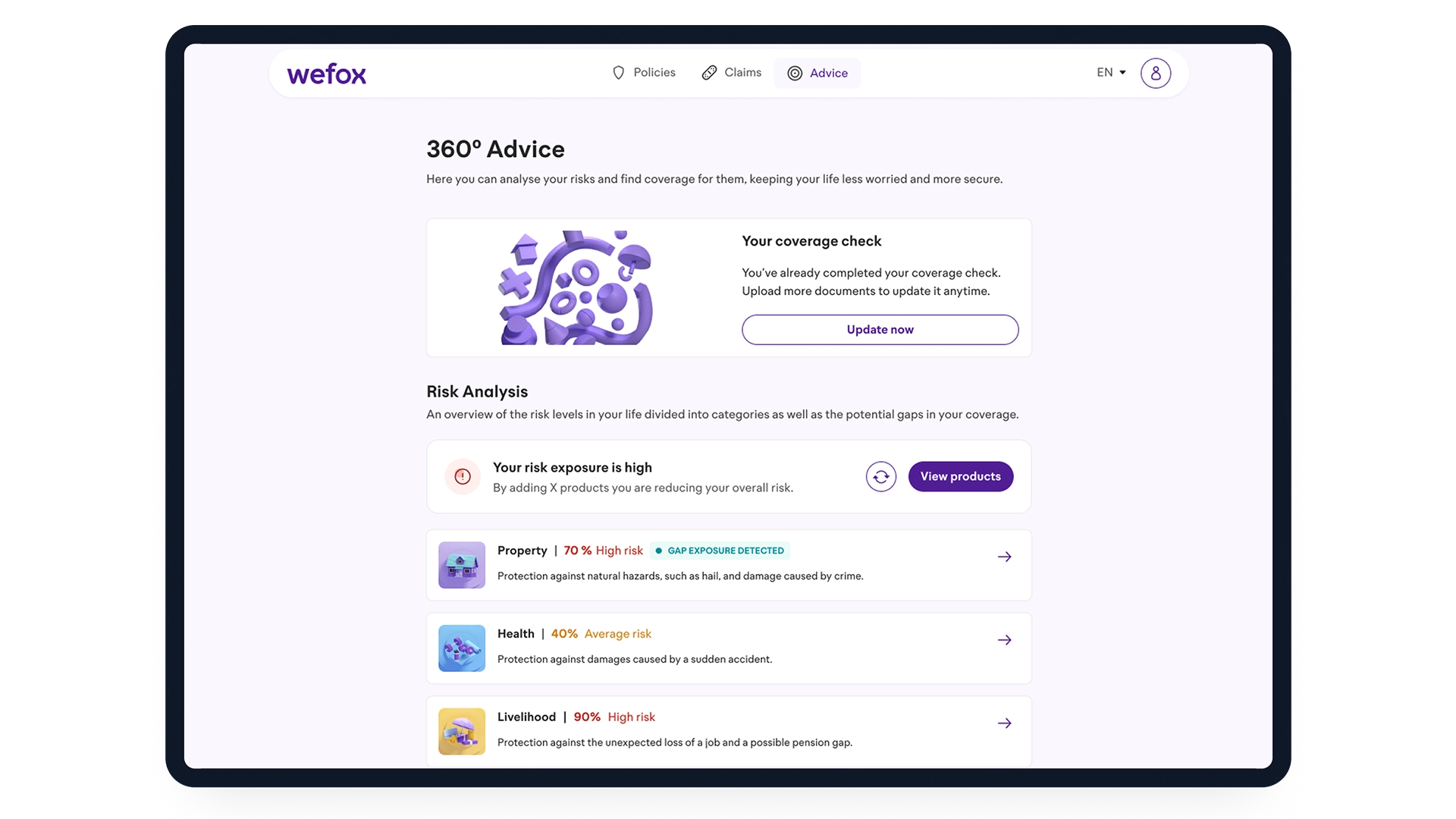
Testing two directions
We developed two visual approaches and compared them through internal A/B testing. One direction used smaller cards and more text, while the other introduced larger visual cards and clearer progress indicators.
Validated direction
Testing showed that the more visual approach made the hierarchy easier to understand and helped users identify key actions more quickly. I also simplified the colour system, using colour more intentionally to communicate severity and urgency rather than relying on multiple competing signals.
The final direction brought together a clearer risk overview, improved survey progress and a more consistent visual hierarchy across web and mobile.
Across several iterations, Risk Analysis evolved into a clearer and more consistent cross-platform experience.
Research and internal testing helped validate key decisions around mobile navigation, survey progress, information hierarchy and the visual representation of risk.
The final visual direction was validated through testing but was not implemented due to organisational changes within the company.
• Testing early helped uncover assumptions that were difficult to see from the designs alone.
• Complex risk information became easier to understand when hierarchy and language did more of the work than colour.
• Cross-platform design works best when the underlying mental model stays consistent, even when the interface changes.