Orga AI Platform

Redesigning an AI platform for developers

A web platform for configuring and managing AI capabilities across different use cases.

B2B
·
AI
·
DESIGN SYSTEMS
Role
Product Designer / UX/UI Designer
Timeline
3 months
01
The opportunity

Creating structure for a growing platform

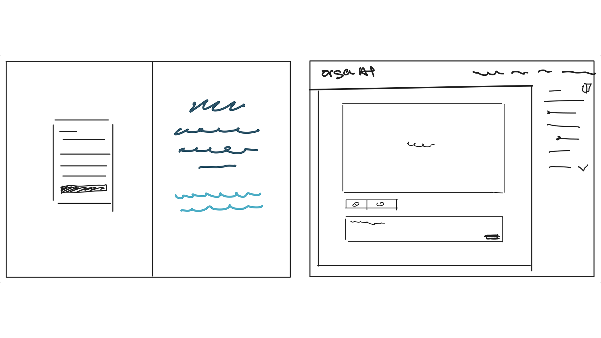
Exploring how the platform could evolve
I started by exploring how the platform could fit within the wider Orga ecosystem, sketching different structures and flows before moving into detailed UI.
These early concepts helped define a clearer foundation for a product that was expanding in scope and functionality.

02
Building the system

Creating a consistent visual system

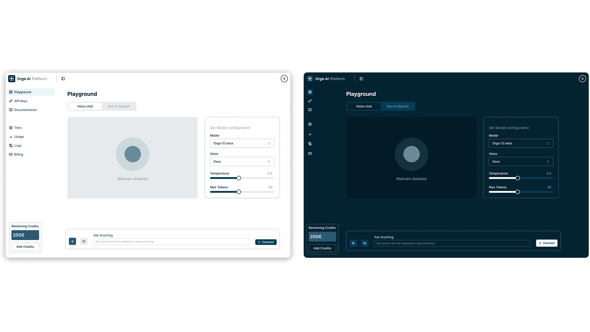
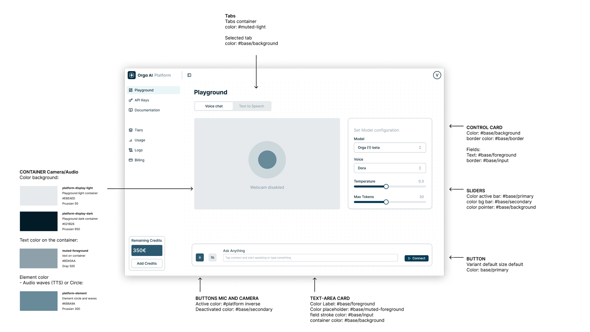
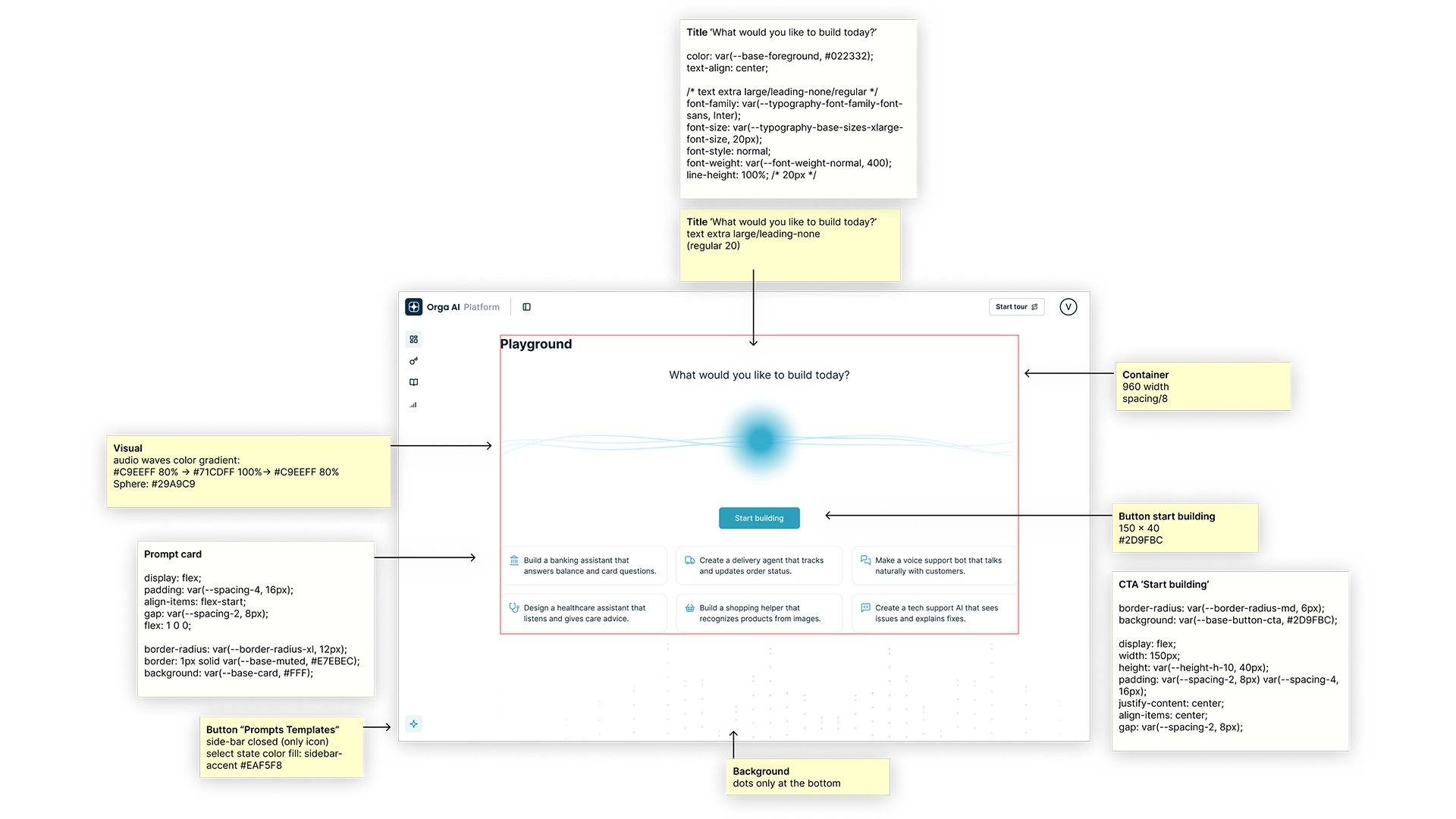
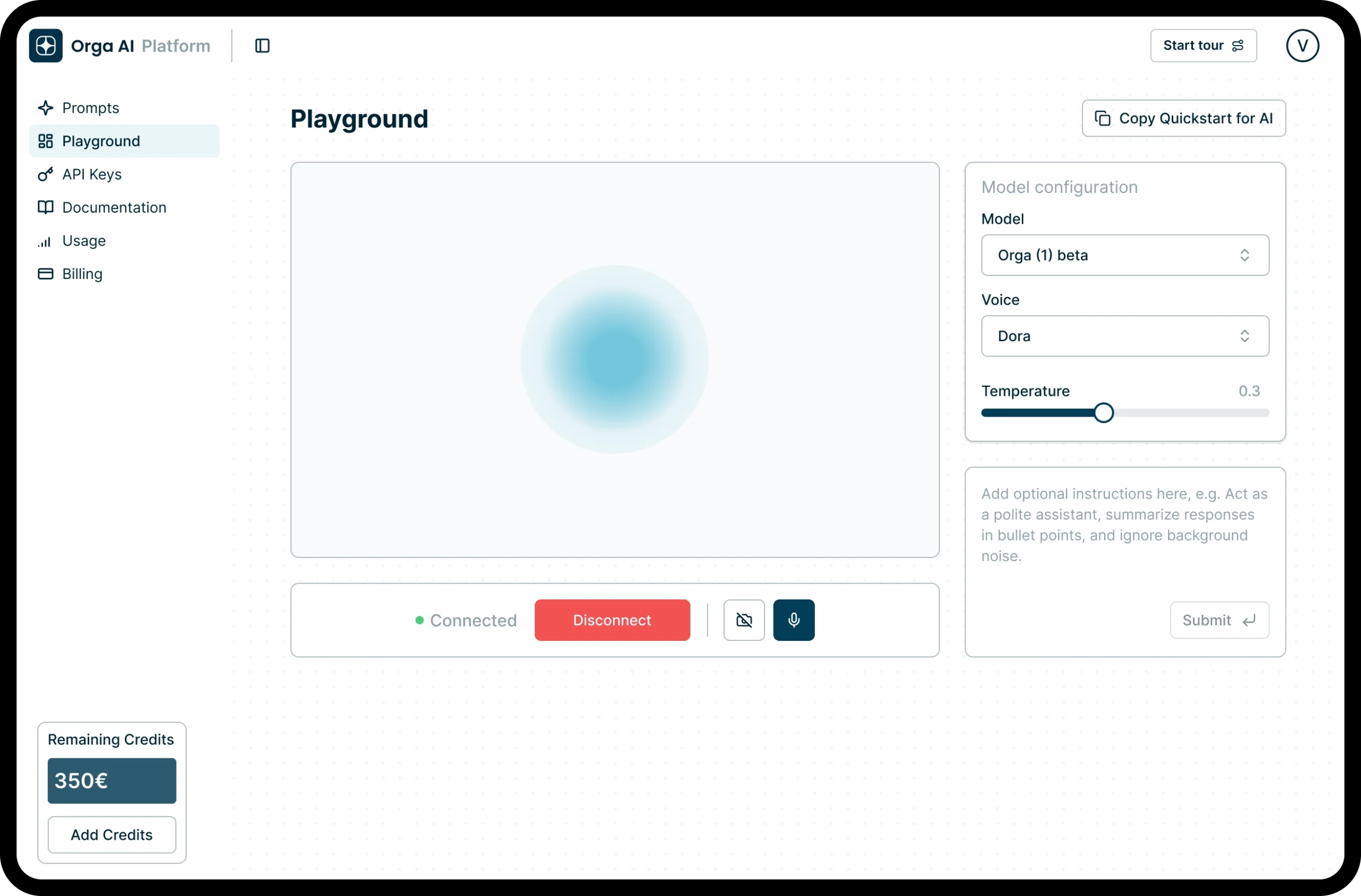
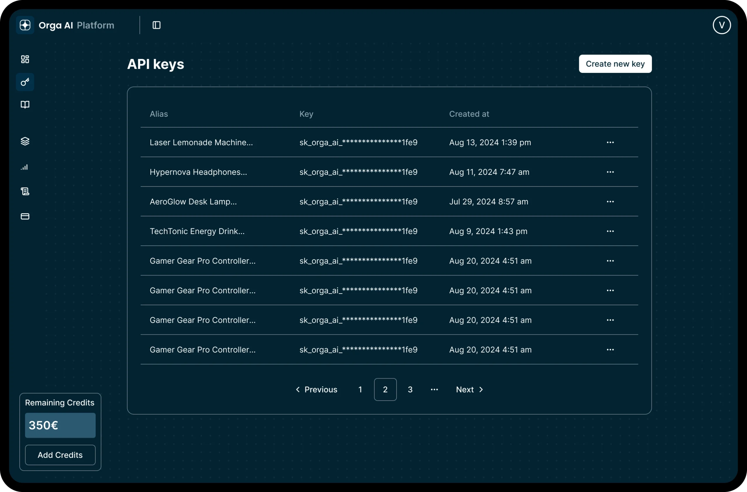
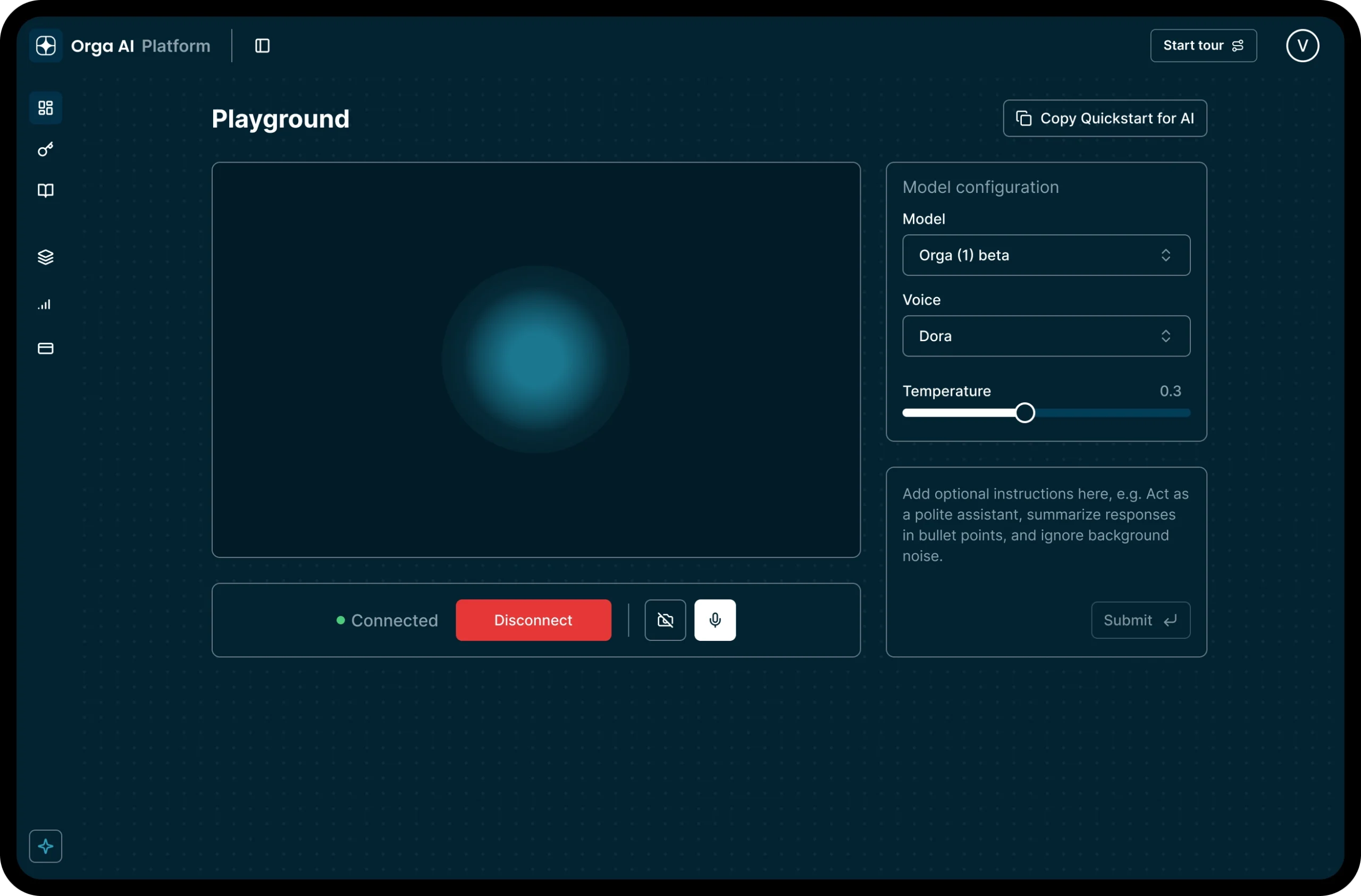
As the platform evolved, I explored light and dark modes and documented reusable patterns, component states and specifications.
This work established a more consistent visual foundation that could support the platform as new functionality was introduced.

Light & dark modes​

A shared visual system across different contexts.

Component specifications​

Reusable patterns, states and implementation details.

03
Evolving the core Platform experience

Creating a clearer path into the product

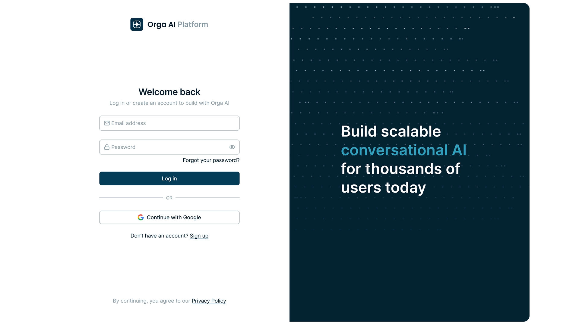
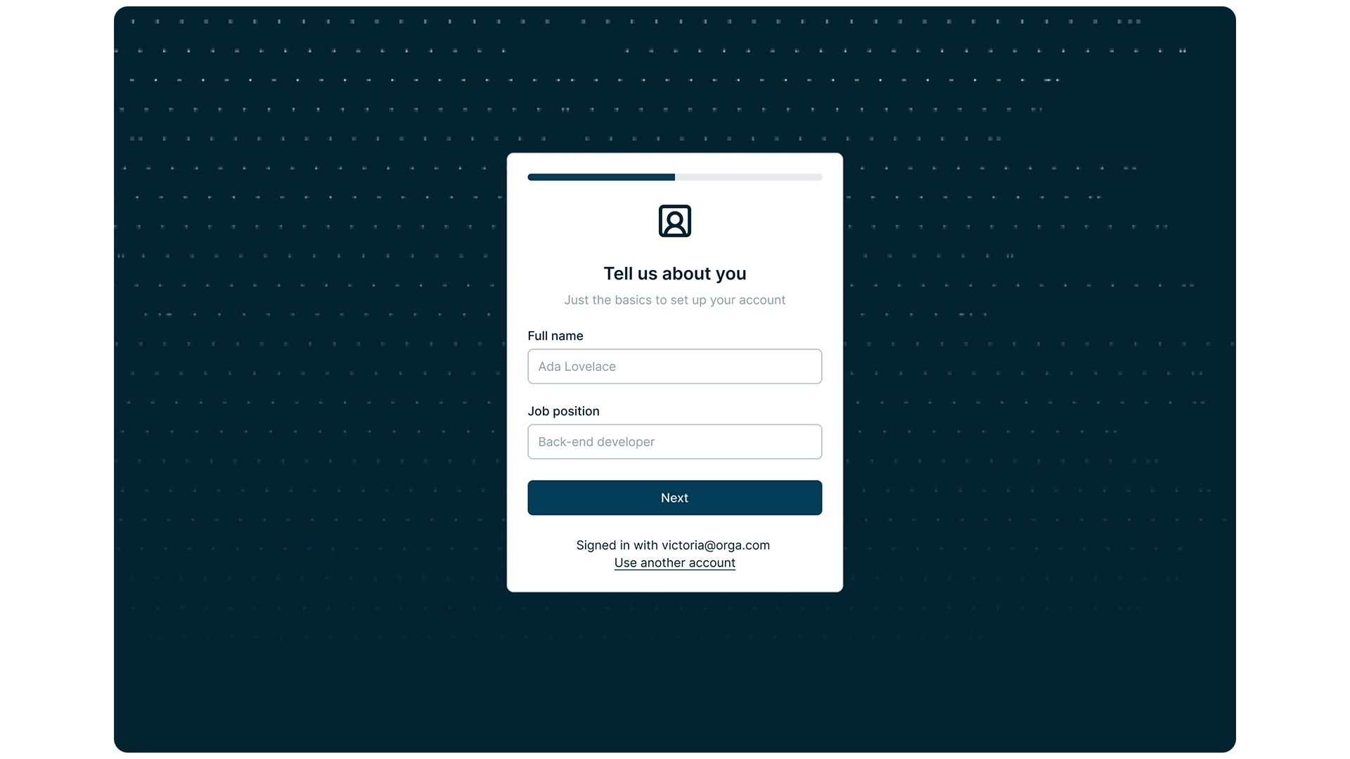
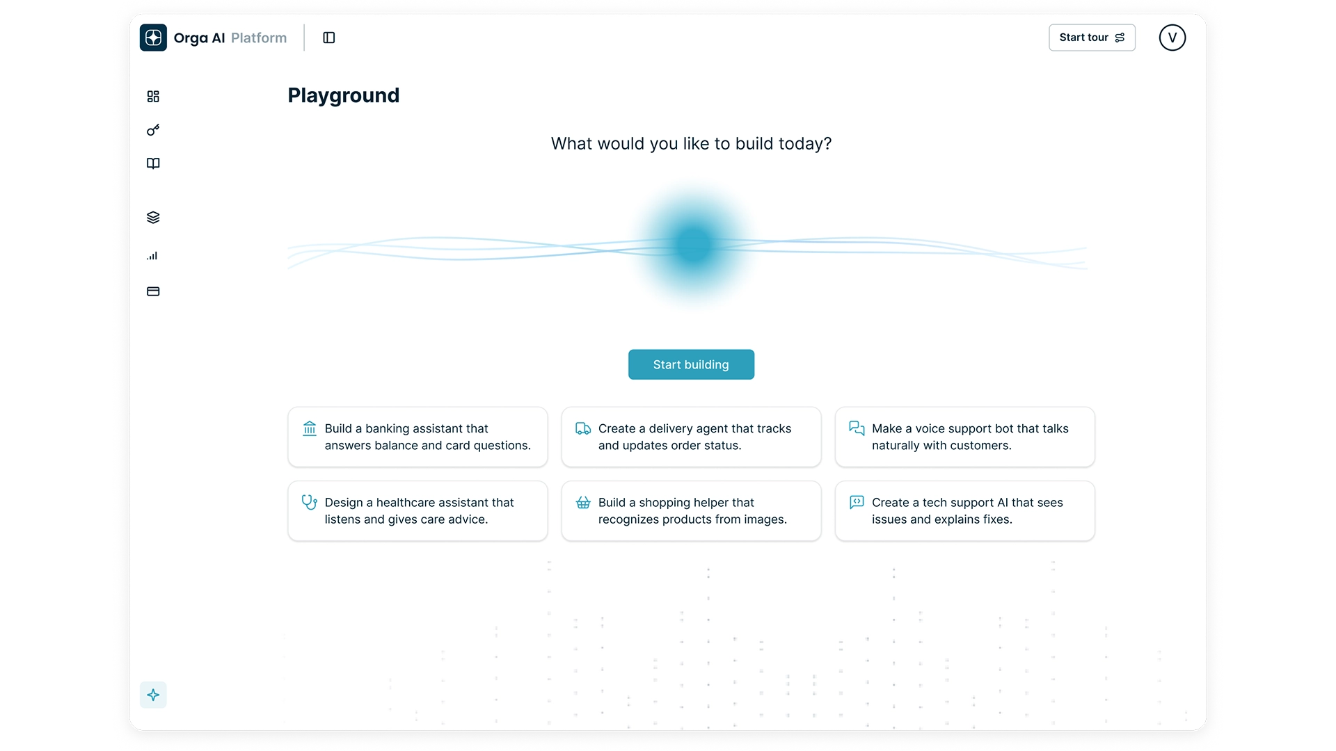
I refined the key entry points into the platform, from authentication and onboarding to the main home experience.
The goal was to help users understand where they were, what the platform could do and how to get started without introducing unnecessary complexity.

Authentication
Onboarding
Home page
04
Structuring a complex Platform

Designing for different workspace levels

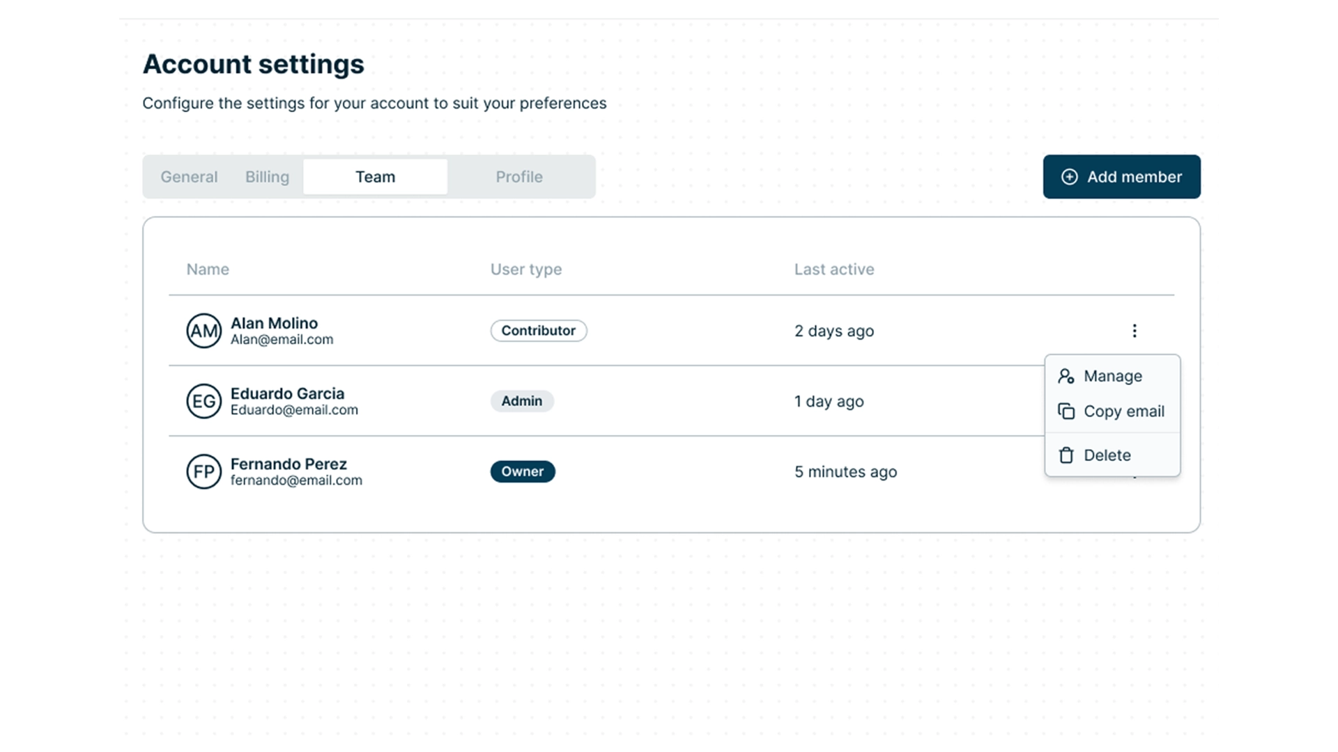
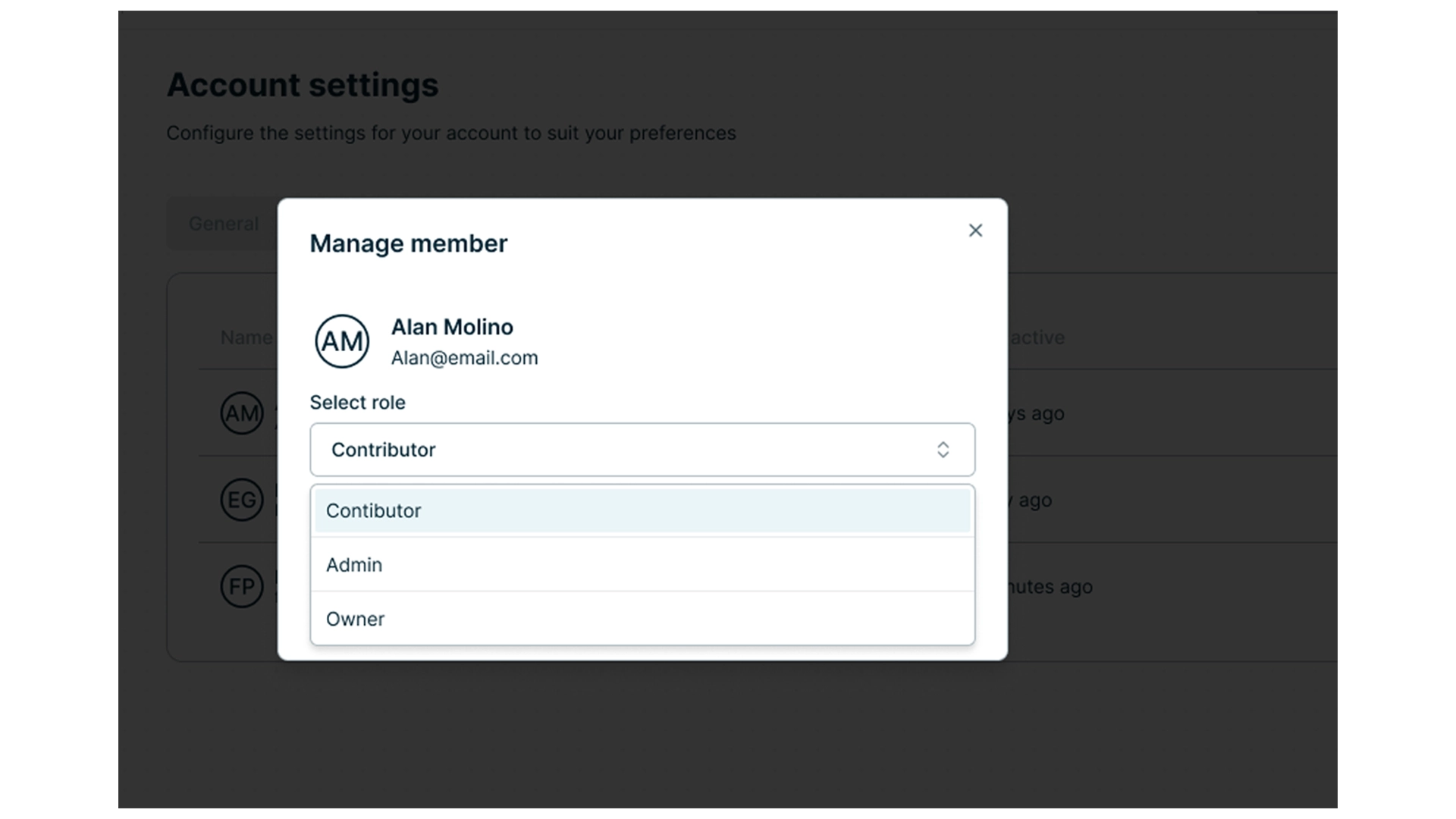
As the platform grew, users needed to work across different organisational levels with different access and responsibilities.
I explored how workspaces, roles and permissions could be structured without making navigation or ownership harder to understand.

05
Making AI capabilities easier to explore

Showing users what they can do

Starting from an empty AI platform can make possibilities feel abstract. Templates gave users concrete examples of common use cases and a clearer starting point for creating their own experiences.
They were designed not only as examples, but as practical starting points users could adapt to their own needs.

06
Designing for what comes next

Exploring control, usage and credits

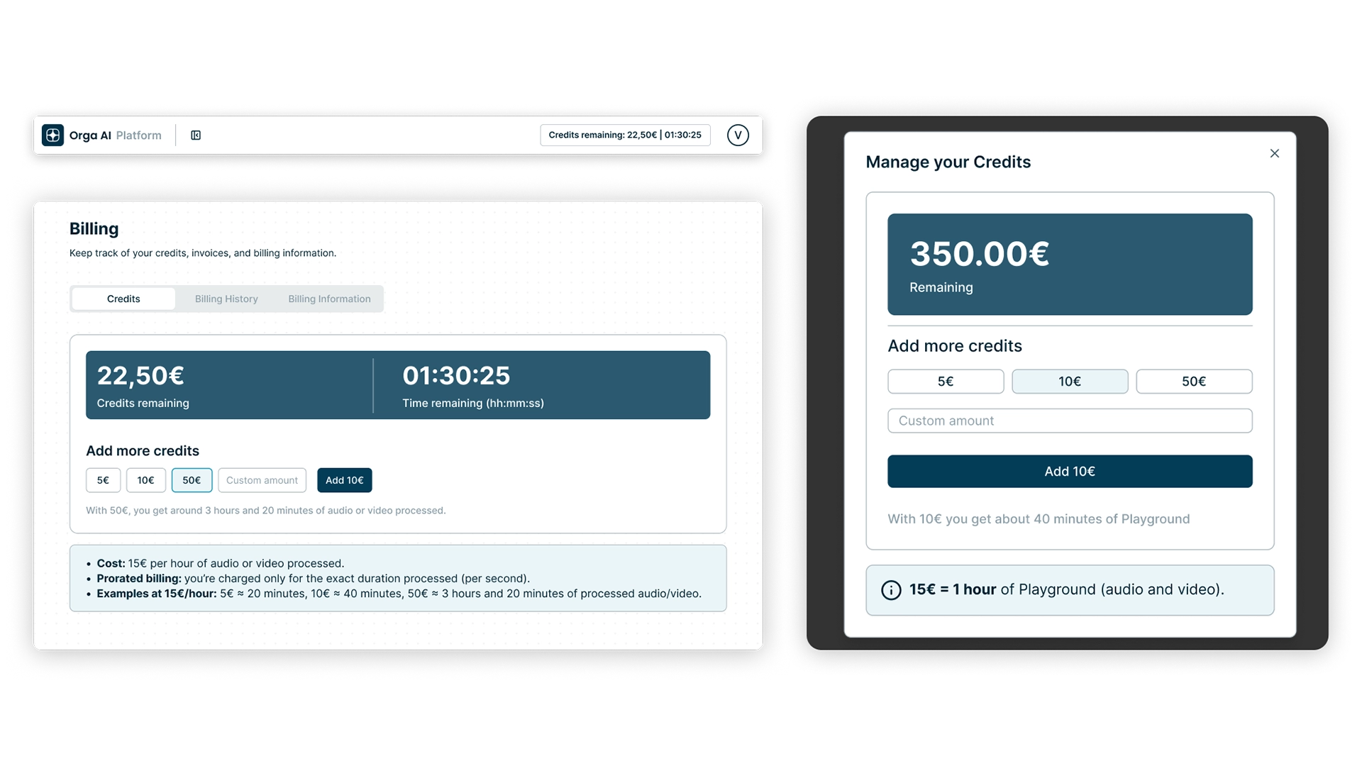
As new product needs emerged, I explored ways to give users more visibility and control over how they used the platform.
These forward-looking concepts included time and budget controls, usage relationships and credits, helping make future limits and resource consumption easier to understand.

07
From design to development

Closing the loop with design QA

After handoff, I reviewed implemented screens against the designs and documented visual and interaction issues for developers.
This design QA process helped resolve inconsistencies and keep the implemented experience aligned with the intended system.

Final experience

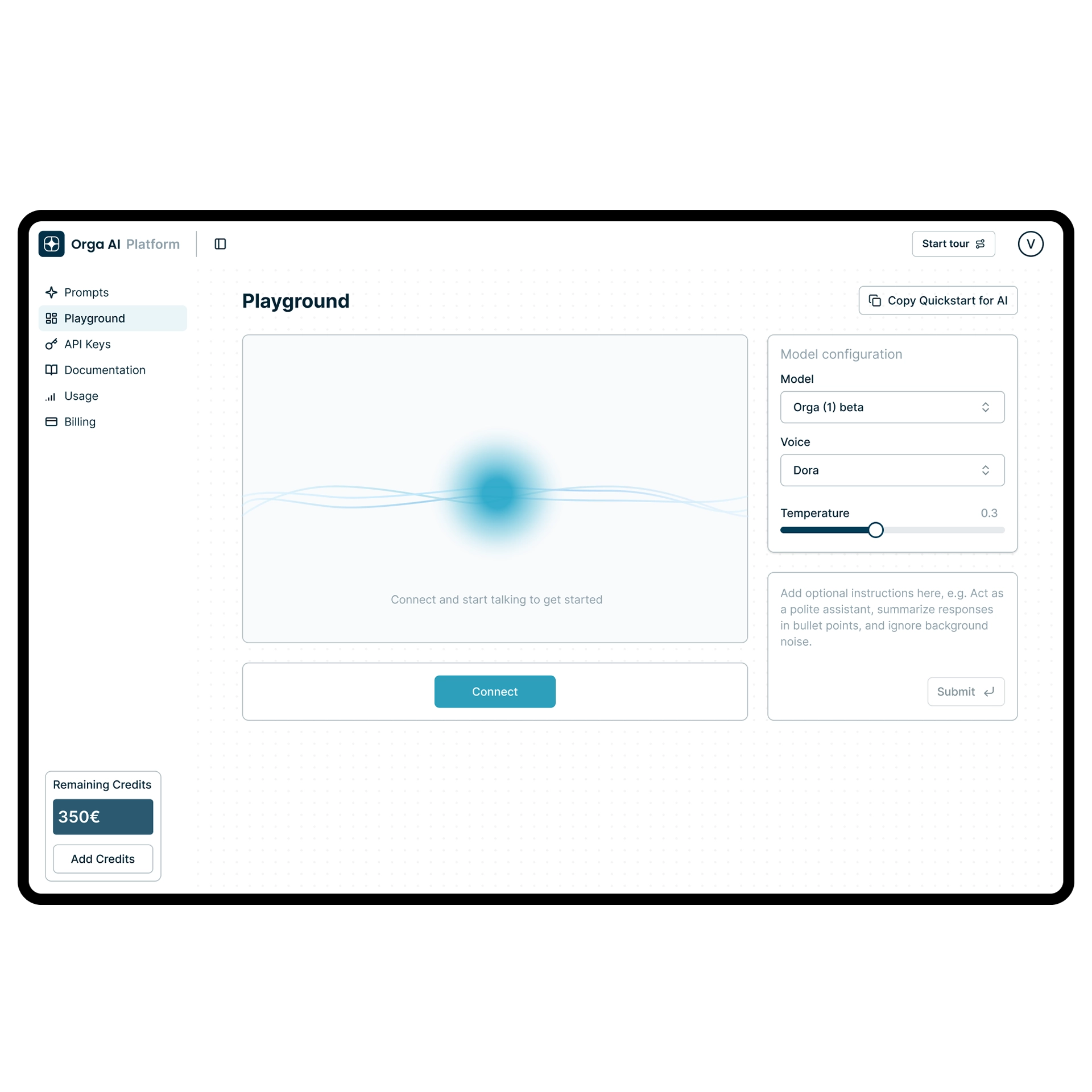
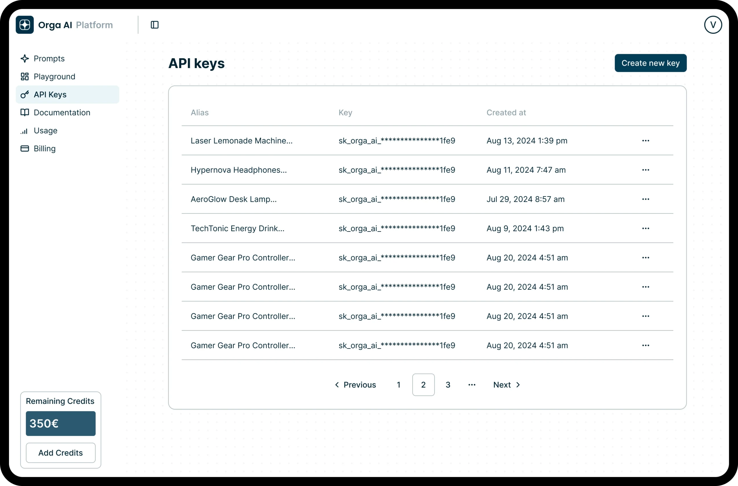
Bringing the platform together

Outcome

A stronger foundation for scale

The project established clearer core flows, reusable UI patterns and workspace structures while creating a more consistent process between design and development.
Together, these improvements provided a stronger foundation for the platform to evolve as new AI capabilities and product requirements emerged.

Key learnings

• Complex B2B products need clear structure and reusable patterns as they grow.

• Making AI behaviour visible helps users understand both what the system is doing and what it can do.

• Reviewing implementation after handoff is essential to maintaining design quality beyond Figma.